

This interactive map compares the Mercator projection versus the Equal Earth projection. Use the slide bar to compare the 2 maps. Image via EqualEarthMap.app.
The Equal Earth projection map is in the news
The best map of Earth is a globe. Any flat map will distort some areas. For years, criticism has been leveled at the widely used Mercator projection map for its noticeable distortions. And on September 4, 2026, the U.N. General Assembly voted 164 to 1 – with six abstentions – to encourage the use of equal-area maps – such as the Equal Earth projection – in certain situations over the Mercator projection map.
The ruling does not change any borders or ban the use of the Mercator map. It simply recommends using an equal earth map in situations where seeing areas of Earth in true proportion are useful.
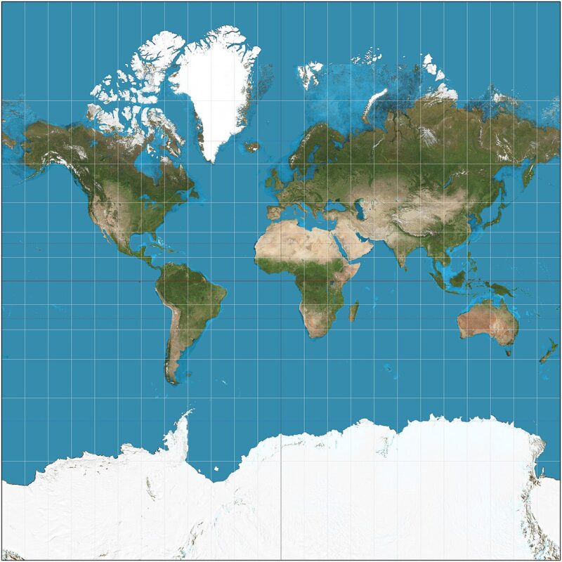
The Mercator map’s biggest drawback is that land closest to the equator looks smaller than it should, while land nearer to the poles looks huge. It’s why people have such a distorted view of the size of Greenland, for instance. And an equal-area Earth map is still a two-dimensional map, so it has its own drawbacks. For example, equal-area maps will distort shapes and angles near the poles.
So what exactly is an equal-area map of Earth?
The best representation of Earth is, of course, a globe. But flat images on pages and screens make globes not always the most practical option. Video by McZerrill/ Pixabay.
What is an Equal Earth projection map?
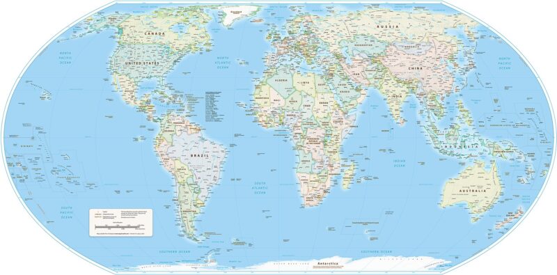
The Equal Earth map is a specific map invented in 2018. Its goal is to keep the relative size of land masses. Mercator maps are useful because they preserve angles that are important in marine navigation. Equal Earth maps are useful for comparing different regions of the world. As NewWorldMap.org explains:
Equal Earth is a modern equal-area projection designed to keep the relative sizes of countries and continents correct without giving the world an unfamiliar, severely stretched outline.
What will you see differently?
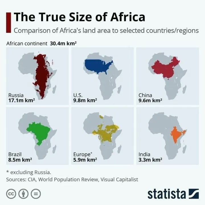
Africa will likely look larger on the Equal Earth map than you are used to seeing on other flat maps. But if you compare the Equal Earth map to the view of Africa on the spinning globe, you will see they are more in harmony. As a specific example, one of the countries on the equator in Africa – Somalia, which curves around the Horn of Africa – is about the size of the U.S. East Coast.
Over in South America, you can see that Brazil also sits on the equator. The Equal Earth map more accurately shows the large size of Brazil. In fact, Brazil is so large that the country’s northernmost point is closer to Canada than it is to Brazil’s southernmost point.
Note the size of Greenland on the Equal Earth map. On Mercator projection maps, Greenland can look as large as Africa.
What other differences do you see between the Equal Earth and Mercator projection maps? Share in the comments below.
Bottom line: Everyone is familiar with the Mercator map, a flattened view of Earth. But what is the Equal Earth projection map, and how does it compare?
Read more: Astrophysicists design ‘radically different’ world map
Like what you read?
Subscribe and receive daily news delivered to your inbox.
More from
Kelly Kizer Whitt


Will fall migration 2026 bring a billion bird night?

Small asteroid hit Earth’s atmosphere Sunday near Australia
Labor Day: Learn its history and traditions
Octans and Apus circle the south celestial pole