By Liz Fuller-Wright, Princeton University Office of Communications
How do you flatten a sphere? For centuries, mapmakers have agonized over how to accurately display our round planet on anything other than a globe.
Now, a fundamental re-imagining of how maps can work has resulted in what might be the most accurate flat map ever made, from a trio of map experts: Princeton astrophysicist J. Richard Gott; Robert Vanderbei, a Princeton professor of operations research and financial engineering who created the “Purple America” map of election results; and Drexel University astrophysicist David Goldberg.
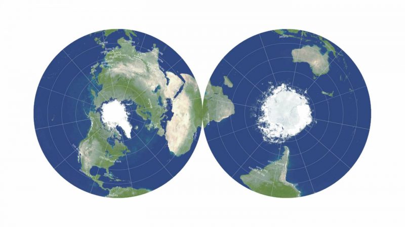
Their new map is two-sided and round, like a DVD or vinyl LP phonograph record. Like many radical developments, it seems obvious in hindsight. Why not have a two-sided map that shows both sides of the globe? It breaks away from the limits of two dimensions without losing any of the logistical convenience — storage and manufacture — of a flat map. Gott said:
This is a map you can hold in your hand.
In 2007, Goldberg and Gott invented a system to score existing maps, quantifying the six types of distortions that flat maps can introduce: local shapes, areas, distances, flexion (bending), skewness (lopsidedness) and boundary cuts (continuity gaps). The lower the score, the better: a globe would have a score of 0.0.
Gott said:
One can’t make everything perfect. A map that is good at one thing may not be good at depicting other things.
The Mercator projection, popular on classroom walls and used as the basis for Google maps, is excellent at depicting local shapes, but it distorts surface areas so badly near the North and South Poles that polar regions are usually simply chopped off.

Using their metrics, the best previously known flat map projection was the Winkel tripel, with a Goldberg-Gott score of 4.563. But that still had the “boundary cut” problem of splitting the Pacific Ocean and creating the illusion of great distance between Asia and Hawaii.

Clearly, a completely new approach was needed. Gott drew a comparison to Olympic high jumpers: In 1968, Dick Fosbury shocked sports fans by arching his back and jumping over the bar backwards. He set a new record and won a gold medal, and high jumpers have jumped backwards ever since. Gott said:
We’re like Mr. Fosbury. We’re doing this to break a record, to make the flat map with the least error possible. So, like him, we’re surprising folks. We’re proposing a radically different kind of map, and we beat Winkel tripel on each and every one of the six errors.
The inspiration came from Gott’s work on polyhedra — solid figures with many faces.
Polyhedral maps are nothing new — in 1943, Buckminster Fuller broke the world into regular shapes and provided instructions for how to fold it up and assemble it as a polyhedral globe. But while he could protect the shapes of continents, Fuller shredded the oceans and increased many distances, such as between Australia and Antarctica.
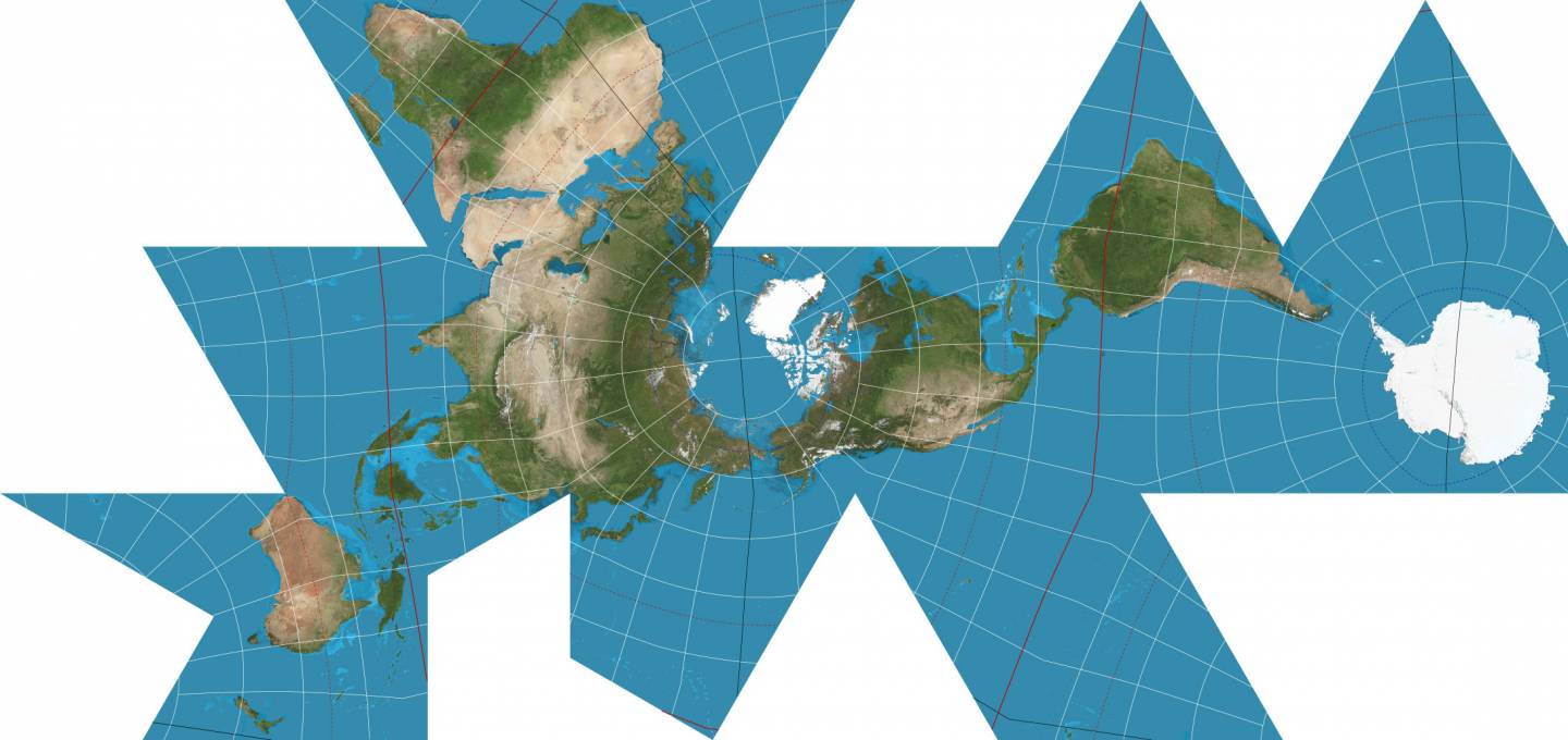
In a 2019 paper, Gott began considering “envelope polyhedra,” with regular shapes glued together back-to-back, which led to the breakthrough idea for the double-sided map.
It can be displayed with the Eastern and Western Hemispheres on the two sides, or in Gott’s preferred orientation, the Northern and Southern Hemispheres, which conveniently allows the equator to run around the edge. Either way, this is a map with no boundary cuts. To measure distances from one side to the other, you can use string or measuring tape reaching from one side of the disk to the other, he suggested. He said:
If you’re an ant, you can crawl from one side of this ‘phonograph record’ to the other. We have continuity over the equator. African and South America are draped over the edge, like a sheet over a clothesline, but they’re continuous.
This double-sided map has smaller distance errors than any single-sided flat map, the previous record-holder being a 2007 map by Gott with Charles Mugnolo, a 2005 Princeton alumnus. In fact, this map is remarkable in having an upper boundary on distance errors: It is impossible for distances to be off by more than ± 22.2%. By comparison, in the Mercator and Winkel tripel projections, as well as others, distance errors become enormous approaching the poles and essentially infinite from the left to the right margins (which are far apart on the map but directly adjacent on the globe). In addition, areas at the edge are only 1.57 times larger than at the center.
The new map can be printed front-and-back on a single magazine page, ready for the reader to cut out. The three cartographers imagine printing their maps on cardboard or plastic and then stacking them like records, to be stored together in a box or slipped inside the covers of textbooks. Gott said:
A thin box could hold flat, double-sided maps of all the major planets and moons in the solar system, or a stack of Earth maps giving physical data, political boundaries, population density, climate, languages, explorers’ voyages, empires at different historical periods or continents at different geological epochs.
To the best of the scientists’ knowledge, no one has ever made double-sided maps for accuracy like this before. A 1993 compendium of nearly 200 map projections dating back 2,000 years did not include any, nor did they find any similar patents. Gott said:
Our map is actually more like the globe than other flat maps. To see all of the globe, you have to rotate it; to see all of our new map, you simply have to flip it over.
Bottom line: A team of astrophysicists has designed a radically different flat world map that is 2-sided and round.
Source: Flat Maps that improve on the Winkel Tripel
The 2021 lunar calendars are here. Order yours before they’re gone!
Like what you read?
Subscribe and receive daily news delivered to your inbox.
More from
EarthSky Voices