


If you click play on the interactive above, you’ll see the motions of galaxies in our local supercluster, from 13 billion years ago to the present day.
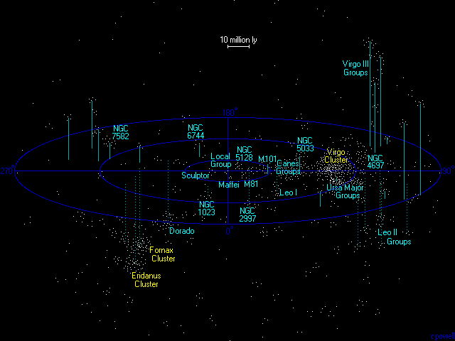
Where’s our home galaxy, the Milky Way, in this interactive? Look below at the still graphic, for the yellow letters marked MW. Our Milky Way is part of what’s called the Local Group, which spans about 10 million light-years and contains several dozen galaxies. The Local Group, in turn, is part of the Virgo Supercluster, which spans just over 100 million light-years and is thought to contain at least 100 galaxy groups and clusters. The interactive above is part of a study by a team of astronomers from Maryland, Hawaii, Israel, and France. They say it’s the most detailed map ever of the orbits of galaxies in our extended local neighborhood. It shows the past motions of some 1,400 galaxies within 100 million light-years of our Milky Way.
The study called Action Dynamics of the Local Supercluster. It’s published in the December 4, 2017 issue of the peer-reviewed Astrophysical Journal.
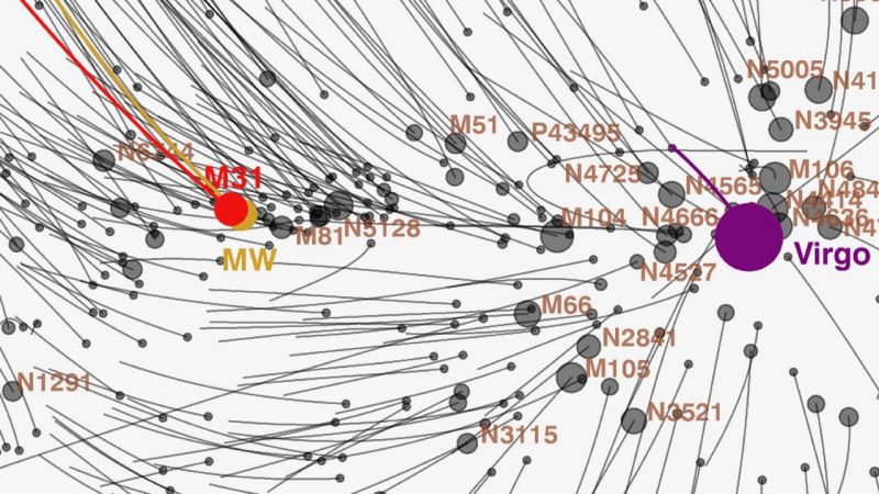
In the interactive, you’ll notice the galaxies are moving toward something, a gravitational attractor represented by the big red dot more or less in the center of the mapped area (and in purple in the still graphic just above). This attractor is the Virgo Cluster, a large cluster of galaxies at the heart of the Virgo Supercluster (all located in the direction to the constellation Virgo in our sky; hence their names).
The Virgo Cluster alone – which is about 50 million light-years from us, or in the midst of the Virgo Supercluster’s 100 million light-years – has 600 trillion times the mass of our sun. These astronomers explained in their statement that the Virgo Cluster is pulling other galaxies toward itself, and absorbing them:
Over a thousand galaxies have already fallen into the Virgo Cluster, while in the future all galaxies that are currently within 40 million light-years of the cluster will be captured. Our Milky Way galaxy lies just outside this capture zone. However the Milky Way and Andromeda galaxies, each with 2 trillion times the mass of the sun, are destined to collide and merge [with each other] in 5 billion years.
The study – and the interactive at top – are based on the measurement of 18,000 galaxy distances. The astronomers’ statement explained the interactive this way:
With the interactive model, a viewer can pan, zoom, rotate, and pause/activate the time evolution of movement along orbits. The orbits are shown in a reference frame that removes the overall expansion of the universe.
So be sure to click on it, and play around with it!
The lead author of this study is Ed Shaya of the University of Maryland in collaboration with Brent Tully of University of Hawaii, Yehuda Hoffman of Hebrew University in Israel, and Daniel Pomarede of University of Paris-Saclay in France. These scientists used what they said is a novel method for determining galaxy orbits, which they called numerical action. Brent Tully said:
For the first time, we are not only visualizing the detailed structure of our Local Supercluster of galaxies but we are seeing how the structure developed over the history of the universe. An analogy is the study of the current geography of the Earth from the movement of plate tectonics.
The astronomers’ statement also explained:
These dramatic merger events are only part of a larger show. There are two overarching flow patterns within this volume of the universe. All galaxies in one hemisphere of the region – including our own Milky Way – are streaming toward a single flat sheet. In addition, essentially every galaxy over the whole volume is flowing, as a leaf would in a river, toward gravitational attractors at far greater distances …
Representations of the orbits in the Virgo Supercluster can also be seen in the video below:
Bottom line: A team of astronomers has made the most detailed map ever of the orbits of galaxies in our local supercluster. It shows the past motions of some 1,400 galaxies within 100 million light-years of our Milky Way.
Like what you read?
Subscribe and receive daily news delivered to your inbox.
More from
Deborah Byrd


