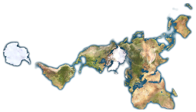
Africa is bigger than you probably think. But how big is Africa? Kai Krause, who is a software and graphical user interface designer, created this map showing the true size of Africa. Why didn’t we know this? We didn’t because most maps we see everyday use a Mercator projection, which allows our round globe to be shown on a flat map.

The Flemish geographer and cartographer Gerardus Mercator gave the world the Mercator projection, which was useful in navigating the seas, in 1569. You would need to see Earth’s continents with your own eyes, from space, to judge Africa’s true size. Or you might use a Dymaxion map, which lets you see the true size of Africa much more clearly.
If you made a sphere of all Earth’s water, how big would it be?

The map above is a Dymaxion map, and it depicts Earth’s continents as “one island,” or nearly contiguous land masses. Cool, yes? R. Buckminster Fuller’s created it. His version of a round globe that fits on flat map – the Dymaxion map – first appeared in Life magazine in 1943.
By the way, Africa isn’t the biggest continent. Asia is.
#1 Asia – (44,579,000 sq km)
#2 Africa – (30,065,000 sq km)
#3 North America – (24,256,000 sq km)
#4 South America – (17,819,000 sq km)
#5 Antarctica – (13,209,000 sq km)
#6 Europe – (9,938,000 sq km)
#7 Australia/Oceania – (7,687,000 sq km)
Bottom line: Africa is bigger than you think. You can see its size on this infographic created by Kai Krause. Or you can see its size on a Dymaxion map, created by R. Buckminster Fuller.


