Using two decades of data from the Sloan Digital Sky Survey, astronomers at Johns Hopkins University have created an interactive map that lets you scroll to the edge of the observable universe. And on November 17, 2022, the astronomers made this map available online. You can also download it for free. Travel from spiral galaxies to redshifted galaxies and farther, back 13.7 billion years. As a matter of fact, the points on the map plot the actual position and colors of 200,000 galaxies.
Explore the map for yourself here.
Interactive map of the universe
Map creator Brice Ménard of Johns Hopkins University said:
Growing up I was very inspired by astronomy pictures, stars, nebulae and galaxies, and now it’s our time to create a new type of picture to inspire people. Astrophysicists around the world have been analyzing this data for years, leading to thousands of scientific papers and discoveries. But nobody took the time to create a map that is beautiful, scientifically accurate and accessible to people who are not scientists. Our goal here is to show everybody what the universe really looks like.
Ménard explained what you see when you look at the map:
In this map, we are just a speck at the very bottom, just one pixel. And when I say we, I mean our galaxy, the Milky Way which has billions of stars and planets. We are used to seeing astronomical pictures showing one galaxy here, one galaxy there or perhaps a group of galaxies. But what this map shows is a very, very different scale. From this speck at the bottom, we’re able to map out galaxies across the entire universe, and that says something about the power of science.
He added:
I think everyone can get something out of this map and better understand our position in the entire universe.
Explore the map for yourself here.
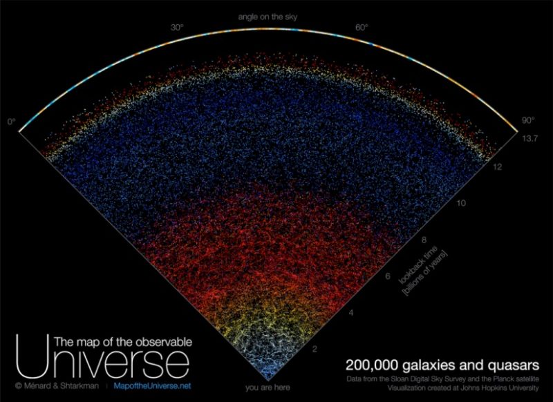
Bottom line: A new interactive map of the universe lets you scroll from our position in the Milky Way all the way to the edge of the observable universe.
Like what you read?
Subscribe and receive daily news delivered to your inbox.
More from
Kelly Kizer Whitt